Branding is more than just a logo. Branding is the process of creating a perception of a business or person using consistent messaging through visual elements (like your logo and colours) and written language. Your business’s branding will help you to carve out your own unique space in your industry so that your customers will associate your visual attributes with your business and products.
Good branding is achieved through consistency. Having a brand style guide is important to ensure that all visual representations of your business are on brand. In this article, we’ll take you through the step-by-step process of how to create a brand style guide in Canva.
What are brand guidelines?
One of your company’s most significant assets is a recognisable and memorable brand. Maintaining consistency across your brand’s digital and physical assets is important to ensure that you control the way your business is perceived in every instance. A brand style guide is essentially a document that instructs your employees, designers you may hire and other businesses you collaborate with on how to apply the different elements of your visual identity.
Repetition of the same elements of your brand in specific settings is important so that your audience can learn to recognise these visual elements and associate them with your business, your values and your products.
What should I include in brand guidelines?
Ultimately, what you choose to put into your brand guidelines is completely up to you. Remember that your brand style guide is there to guide you and your team to create a consistent brand appearance across all online and offline presentations of your business.
Here’s what we recommend including in your brand style guide:
- Key words
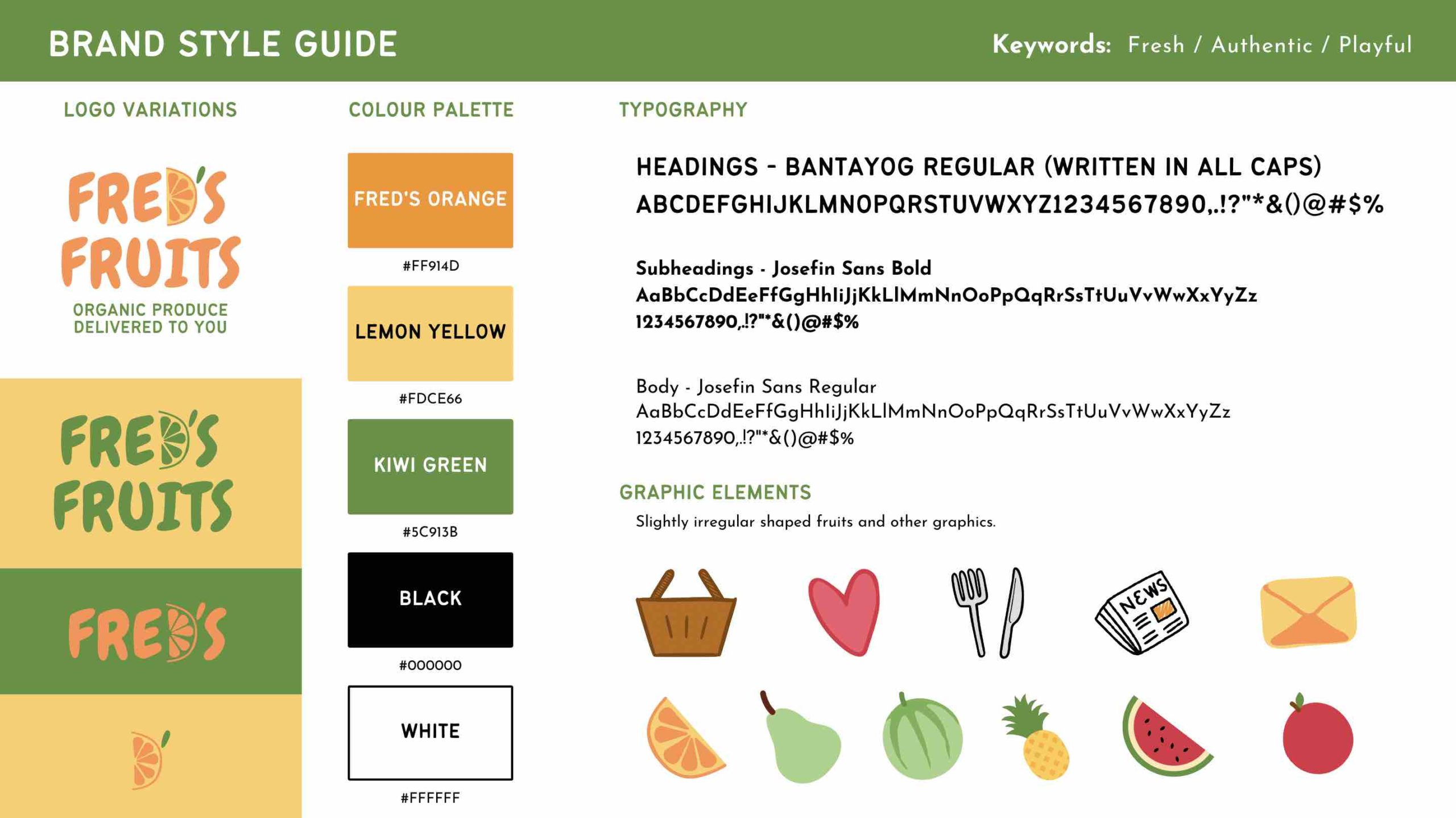
- Logo variations
- Colour palette
- Typography
- Graphic elements
In this article, we’ll show you how to create a 1-page brand style guide, however, if you want to go deeper into exploring your brand, consider expanding your guide by adding more elements, such as:
- Business mission
- Business values
- Target market
- Image treatment (e.g. all photos appear in sepia tone)
- Tone of voice for written copy
1. Choose your keywords
It’s important to differentiate between what you personally think looks good and what makes sense for your brand. That’s why it’s handy to have a few visual keywords that you can continually come back to to figure out what makes the most sense for your business values and what will speak to your target market.
You can think of your visual keywords may be similar to your brand’s values, however, they should also be visually meaningful. For example, say that one of your most important business values is to be sustainable, that’s all well and good, but how does that translate visually? Perhaps you might use the visual keyword earthy, or organic in this instance.
A great way to come up with your visual keywords is to get out a pen and paper and do a quick brainstorming session. Write out everything that comes to mind when you think about your business, your customers, your product, your values and even maybe your location. There are no silly answers here, write whatever comes to mind.
Here are some example keywords to get you going:
| Bouncy | Vibrant | Sophisticated | Mature | Playful |
| Serious | Moody | Organic | Understated | Wild |
| Sleek | Happy | Calm | Classic | Familiar |
| Gentle | Industrious | Original | Peaceful | Romantic |
| Vivacious | Zealous | Warm | Friendly | Minimal |
Once you have a nice long list, decide on the three that feel most relevant and write them down. These will become your guide for the rest of your visual brand identity. If you ever feel as though you’re straying away from your business and into your personal taste, you can ask yourself whether the ideas you’re exploring align with your visual keywords.
2. Logo variations
A logo variant is a slightly altered version of your logo that you employ for certain purposes depending on the context. Depending on how simple or complex your logo is, you may only have one or two variations or you may have more.
It’s important to consider the different settings your logo will be used in and which variations will be most suitable. A more complex, full-colour version of your logo is probably most suited to your website, invoices, product labels, signage, or on business cards. A simplified version may be embroidered onto staff uniforms, as your profile picture on social media, your website favicon. A single-colour or reversed out version may be overlaid onto photos or onto dark or multicolour backgrounds.
Check out these responsive logos of major brands to see the different variations they use depending on the amount of space available in a given scenario. Resize your browser window to see the logos transform.
![]()
3. Colour palette
All businesses should have a small set of brand colours that they can employ whenever they need to create visual content.
While there is no magic number for the amount of colours you need, generally speaking keeping your colour palette simple makes it easy for your staff and designers to know how best to apply colour in designs. It may be tempting to include every colour that appeals to you, but it’s important to choose only the ones that make sense for your business and will speak to your target market.
A good place to start is with your logo. What are the main colours in your logo? These should be incorporated into your palette. Choose one or two colours to be your primary colours. Then choose another one or two to be secondary or accent colours. You may consider using a lighter tint or a darker shade of one of your primary colours. Alternatively, you may use a contrasting colour as a secondary colour.
When including your colour palette in your brand guide, include in the hex codes for each colour so that you can easily apply the numbers in other applications (such as your website) when you need to.
4. Typography
Your brand guide should include a list of the font styles and families that your business uses. Including this information will help your staff, web developers and graphic designers to know from the get-go how to layout copy in a way that is consistent across all platforms and formats.
Your brand guidelines should include:
- Heading font and weight
Your heading font should be eye-catching but easy to read. It can be a little more interesting than your body font if that suits your brand but should not be too complicated so that it’s still easily legible. - Body copy font, weight
Your body copy font should be something that is easy to read when used for a large section of text. You should not use a cursive script or any other fonts that may be difficult to read.
Optional to include:
- Sub-heading font and weight
This will probably be the same as your heading or body font but probably in a different weight, for example if your heading is Raleway Black, your subheading may be Raleway Medium. - Accent font
This is a style of text that you would use sparingly for short sentences here and there purely for emphasis or to create visual interest. You can be a bit more creative and dramatic with this font and choose something that is stylistically different but still compatible with your heading and body fonts such as script or a display font.
To see how different fonts complement each other, you can try using an online generator such as fontjoy.com or fontpair.co. Check out this article by Canva for more examples of great font pairings.
5. Graphic elements
Graphic elements are other visual elements that you might use to convey a message or create a feeling. They exist to support the other elements of your brand. These may include abstract decorative elements, backgrounds, textures, shapes, illustrations or icons. The graphic elements you choose for your business may be as simple as a set of shapes or lines or as complex as a series of illustrations. What is most important is that the graphics are in a consistent style – they should appear as though they are part of the same family.
Action
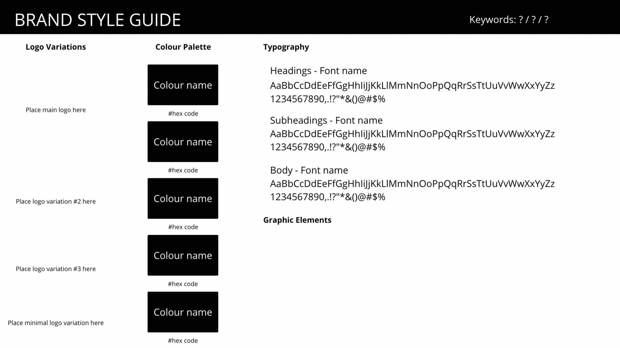
Now it’s your turn. Create a 1-page brand style guide using the Canva template we’ve created here, follow the instructions on the first page to make a copy of the template you can work on in your own Canva account.